Photographers and photo editors spend hours making tiny visual decisions: white balance, skin tone, contrast, shadow detail and colour harmony. That makes eyewear a little more complicated than it is for general screen use.
If a lens visibly warms the screen, you may start compensating for a colour cast that is coming from the glasses rather than the image itself. For colour-sensitive editing, the useful question is not simply whether a pair is marketed as blue-light glasses. It is whether the lens lets you keep judging colour with confidence.
Why lens tint matters for photo editing
Yellow and amber lenses change the light reaching your eyes. That can make whites look warmer, cool greys shift, and blues appear less vivid.
For casual browsing, that may not matter. For Lightroom, Capture One, Photoshop or any colour-sensitive workflow, even a subtle shift can make editing less straightforward.
FOR COLOUR-SENSITIVE EDITING
Your lens should not become another colour adjustment.
If photo editing is part of your day, look for a lens that keeps the screen looking as natural as possible while still giving you the optical features you want.
What photographers should look for
1. Test the lens against a calibrated screen
Open an image with neutral whites, greys and skin tones. Put the glasses on and take them off several times. If the image becomes obviously warmer through the lens, that is important information for editing work.
2. Check the spectral transmittance data
A single “blue light percentage” does not tell you enough. A spectral transmittance curve shows which wavelengths are being filtered and how strongly across the visible range.
PROJECT CLÆR publishes the CLÆR SPECTRUM™ test data on our Technology page. For a plain-English explanation, read our guide to reading a blue-light lens test report.
3. Pay attention to reflections
Bright monitors, studio lights and windows can all create reflections on lenses. A good anti-reflective treatment can make the glasses look clearer and reduce distracting reflections across the lens surface.
4. Think about the whole workday
Photographers move between culling, editing, calls, client reviews and sometimes shooting. Fit matters because a frame that feels fine for ten minutes can become annoying over a long editing session.
Yellow lenses vs clearer-looking lenses
Yellow or amber lenses are not inherently wrong. They simply make a different trade-off by changing more of the visible spectrum.
For non-colour-sensitive work, that may be fine. For colour grading, skin-tone correction and print preparation, many photographers prefer a clearer-looking lens because it creates less obvious colour shift.
For more on this, read Do Blue Light Glasses Change Screen Colours?
If you also work in interface design, our guide to working in Figma without a heavy yellow cast covers colour-sensitive UI and UX work.
Can blue light glasses and colour accuracy coexist?
They can be designed to reduce transmission selectively while preserving a more natural-looking screen, but no visible-light filter should be judged only by marketing copy. The actual lens data and the colour shift you see on your own display matter more.
That is why PROJECT CLÆR focuses on selective blue-violet filtration and publishes the underlying test curve rather than relying on one headline number.
Quick answers for photographers
Can blue light glasses affect white balance while editing?
Yes. A visibly warm lens can make whites and cool tones appear warmer, which can influence how you judge an image.
Should photographers avoid all blue-light lenses?
Not necessarily. The important distinction is how much visible colour shift the lens creates and whether that is acceptable for your editing workflow.
What should I test before buying?
Check the lens against a real image on your normal monitor, especially whites, greys, blues and skin tones. Also review the lens data if the brand publishes it.
Which PROJECT CLÆR frames use the same lens system?
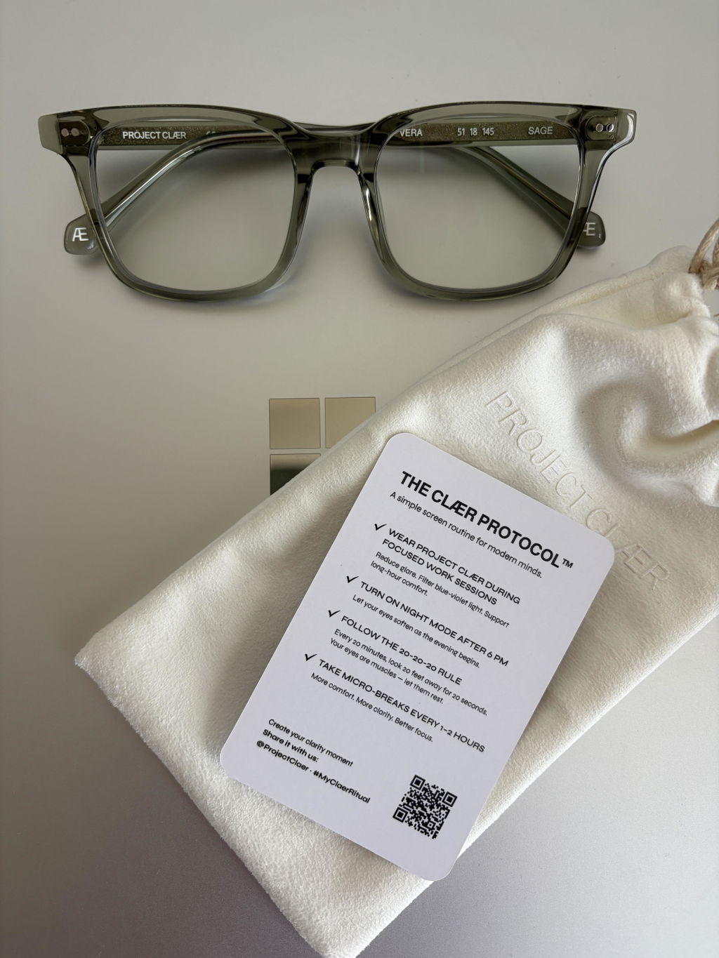
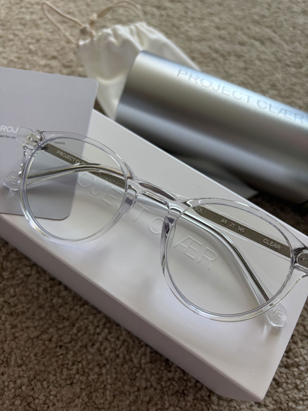
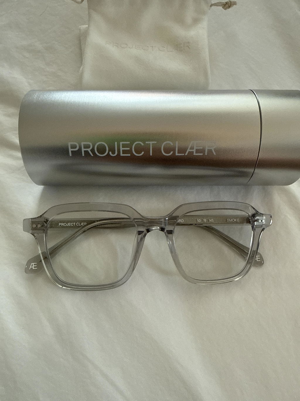
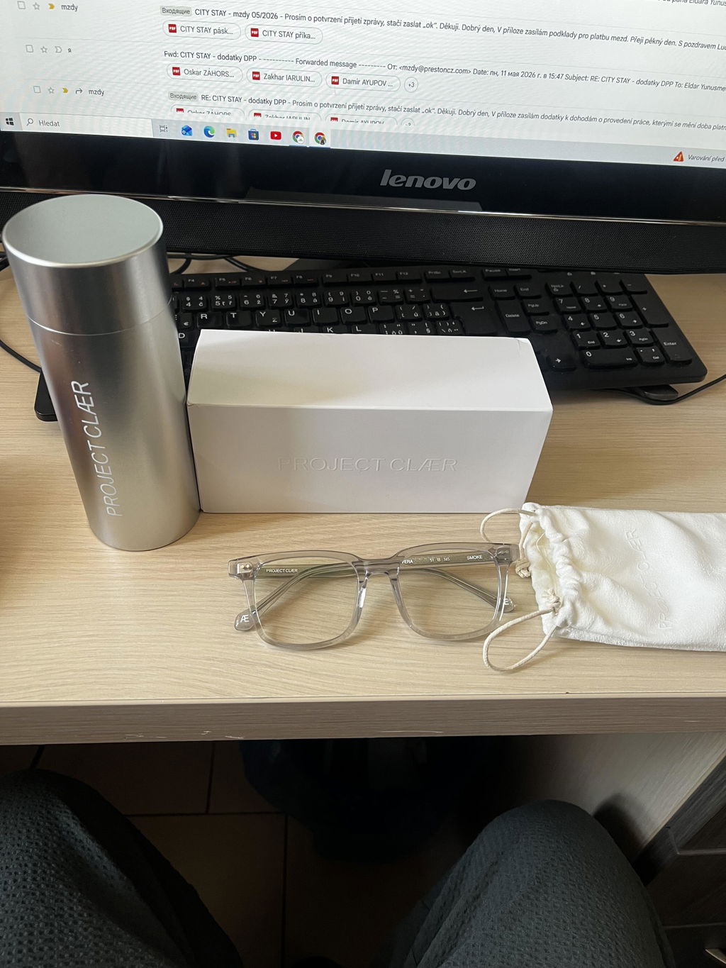
NORD, SOL and VERA all use the same CLÆR SPECTRUM™ lens system, so the choice comes down to frame shape and fit.
— PROJECT CLÆR